


IHANA®
IHANA selects the finest and freshest organic ingredients in their skin care products. they are a cosmetic brand with directed at spreading an organic culture and lifestyle to their consumers.
The logo is simple, scalable, modern and legible from almost any distance. the logo is designed with the intention of it becoming a vessel for the organic and natural essence of the company to shine through.


the repetitive and rotative style of the logo mark was influenced by the natural essence of sacred geometry. sacred geometry is the belief that a god is the geometer of the world. The geometry used in the design and construction of religious structures such as churches, temples, mosques, religious monuments, altars, and tabernacles has sometimes been considered sacred.
the typeface is bold, recognisable and modern which was chosen to inspire and create clean packaging design from the get go. the packaging needs to marry the logo and visa versa.

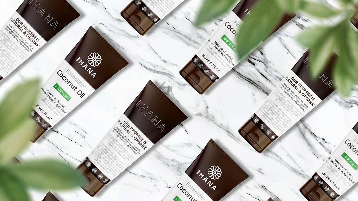
I used images of the active ingredients to motivate the colours and design of each of the products. this gives the colour choices subconsciously relate to the ingredients of each of the cosmetic products. the colour association will also promote brand recognition and familiarity.

The packaging design is functional with a big emphasis on crystal clear legibility. the style is minimal and modern with a fair amount of negative space used to separate different content. the colour in the design is very selective used to highlight key points and differentiate the hierarchy in the communication.


The name of the product and active ingredient are intentionally layed out in a style that will convey the message as easily as possible while also marrying the different active ingredients with the rest of the brands products.

the packaging of the facial mist box was designed to convey a strong bold and communicative design. the left aligned content gives the packaging a more contemporary and modern feel. the corners of the box asist in anchoring the left aligned copy.


the name of the product is listed with a trademark above the type of product which is inside of the packaging. this will assist with clear communication. It is very important that the largest visual message is the type of product.
the green all skin types serves two purposes. firstly it lets the consumer know who the product is for. Secondly it assists the logo in unifying the products under the one brand. this is necessary because the logo is placed above different colour backgrounds.


DOWNLOAD THE MOCK UPS I USED IN THIS PROJRCT HERE:
https://yellowimages.com/stock/250ml-plastic-cosmetic-jar-w-silver-matte-cap-mockup-high-angle-shot-12925?yi=1752
https://yellowimages.com/stock/plastic-face-wash-tube-mockup-12799?yi=1752
https://yellowimages.com/stock/amber-spray-bottle-w-glossy-paper-box-mockup-31662?yi=1752


